Still
Editorial
Tools
Adobe InDesign and Photoshop
Project Overview
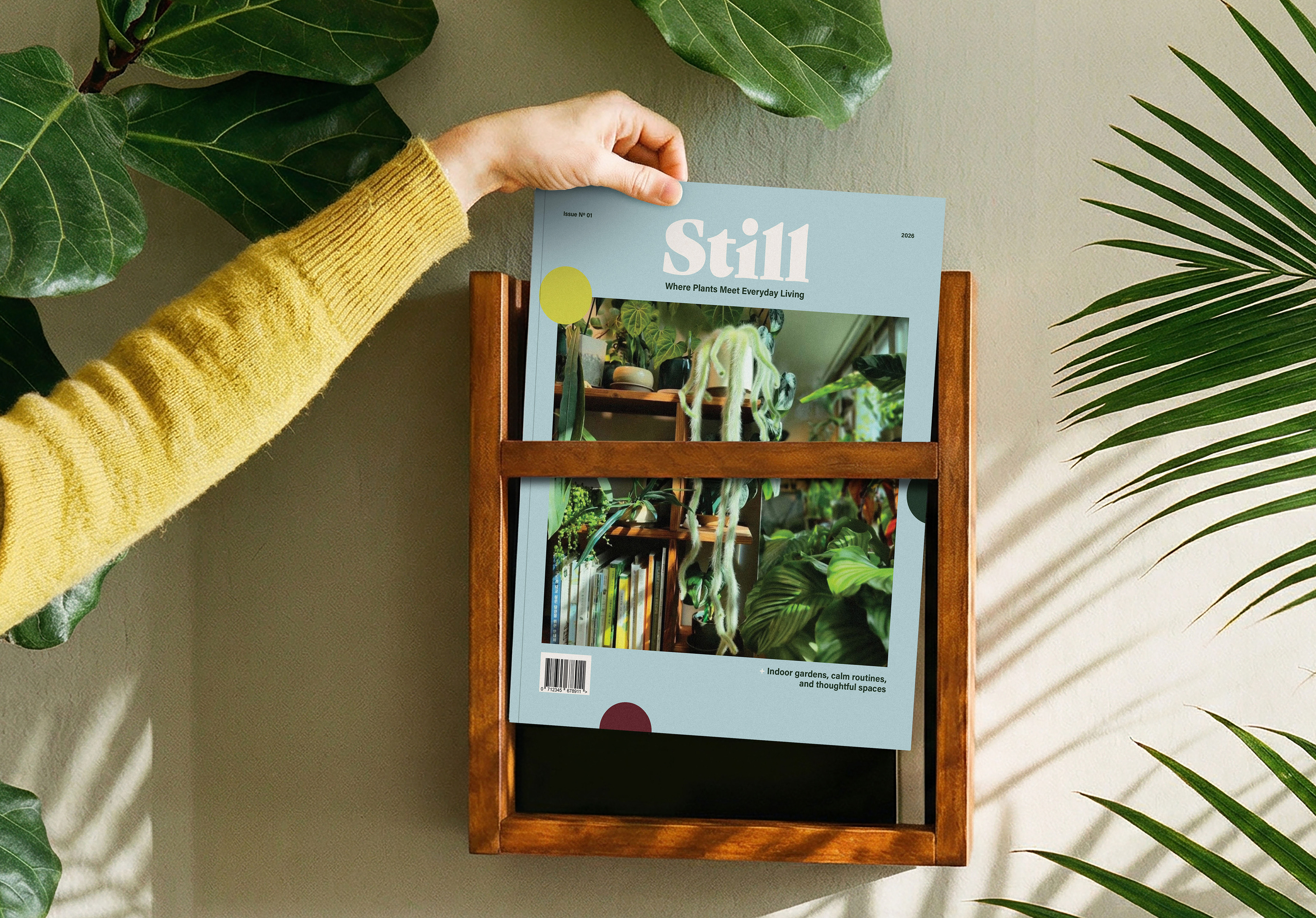
Still, a personal project, is a contemporary plant and lifestyle magazine designed for people living in small spaces. Created for Millennials and Gen Z renters and apartment dwellers, the magazine reframes gardening as a calm, everyday practice rather than a skill-heavy or space-dependent hobby. It invites readers to slow down, care for living things, and find small moments of calm through approachable, low-pressure plant care and styling.
This project was a personal exploration inspired by my love of plants and interior styling, and a reminder to appreciate small moments and move at a slower, more intentional pace.
Development
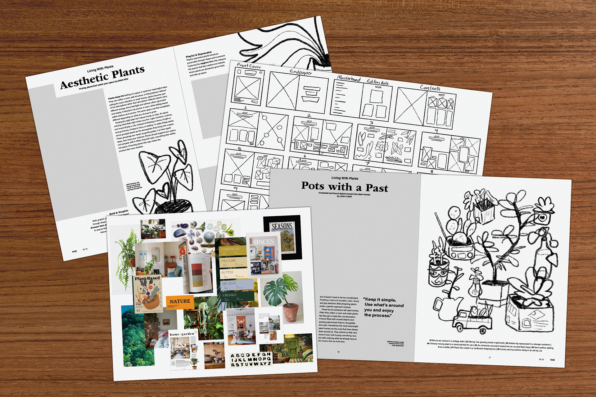
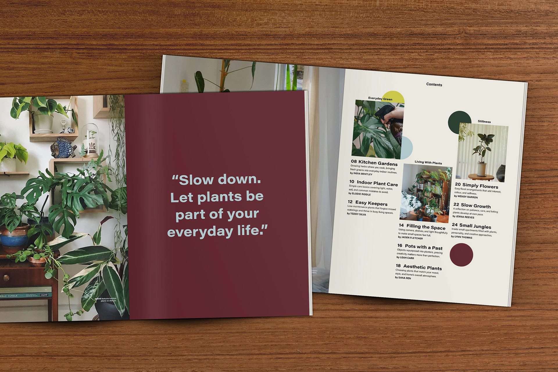
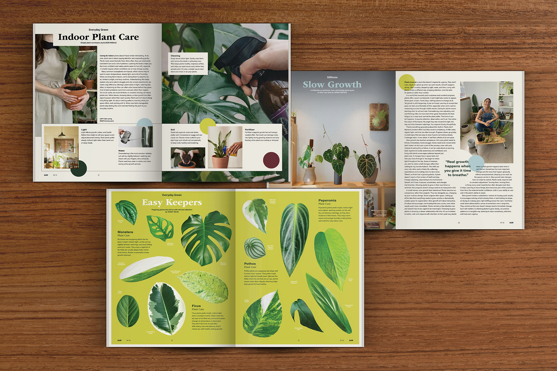
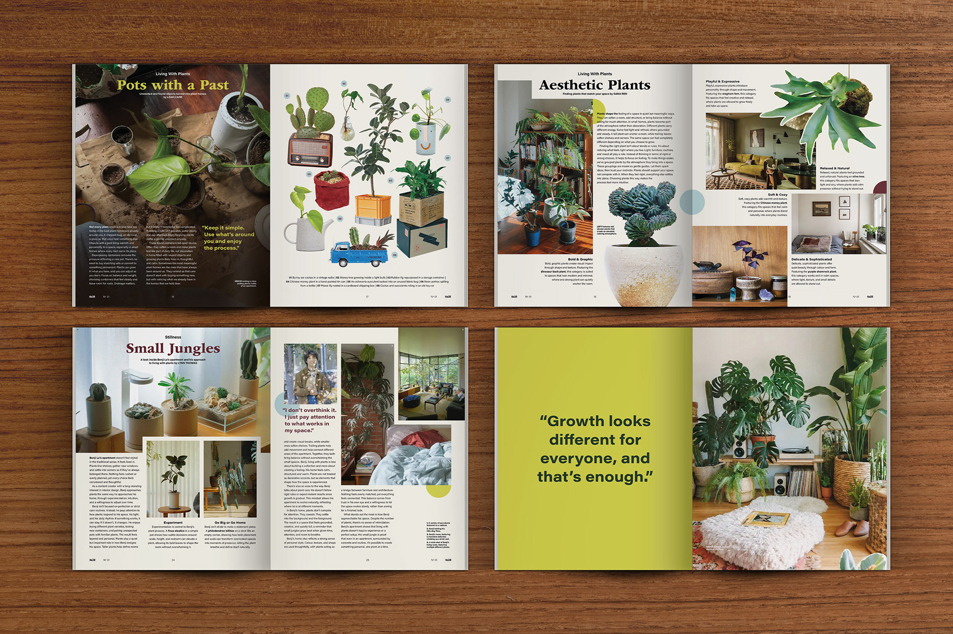
The visual direction for Still is rooted in interior-inspired editorial design, blending structured layouts with the softness of lifestyle and home publications. Open compositions, generous white space, and a three-column baseline grid allow imagery and text to breathe, encouraging a slower, more considered reading experience. A serif and sans serif type pairing is used throughout the magazine, creating a balance that feels timeless yet modern.
Photography (sourced, not my own) features soft grain and muted lighting to create warmth and familiarity, balancing an old-school texture with a clean layout approach. A restrained colour system of soft blues, light and dark greens, and maroon reinforces feelings of calm, growth, and warmth, supporting the magazine’s slow-living, interior-focused tone while remaining flexible and cohesive across spreads.
Key Takeaways
Through this project, I discovered how restraint and pacing can shape the overall tone of an editorial experience. I refined my approach to white space, grid systems, and repetition to support calm, readable layouts, while learning how consistent visual systems create cohesion across long-form publications.