
Art Echo
Brand Identity / Editorial / Photography
Team
Solo project
Timeline
7 weeks
Tools
Adobe Illustrator, InDesign, and Photoshop
Project Overview
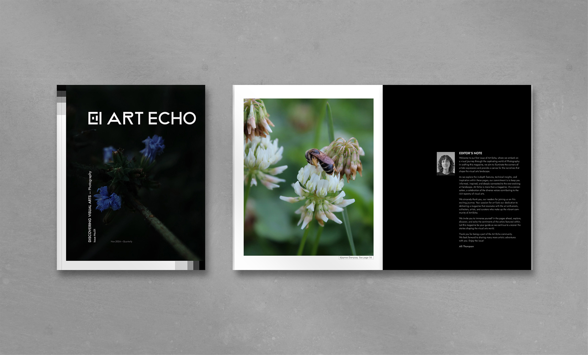
I was tasked with creating a logo, brand identity, and a photography-focused issue for a hypothetical visual arts magazine called Art Echo. The magazine is dedicated to discovering visual arts and sharing content such as featured artists, technical insights, and creative inspiration, aimed at art enthusiasts, collectors, and artists who want to stay connected to contemporary visual culture.
Development
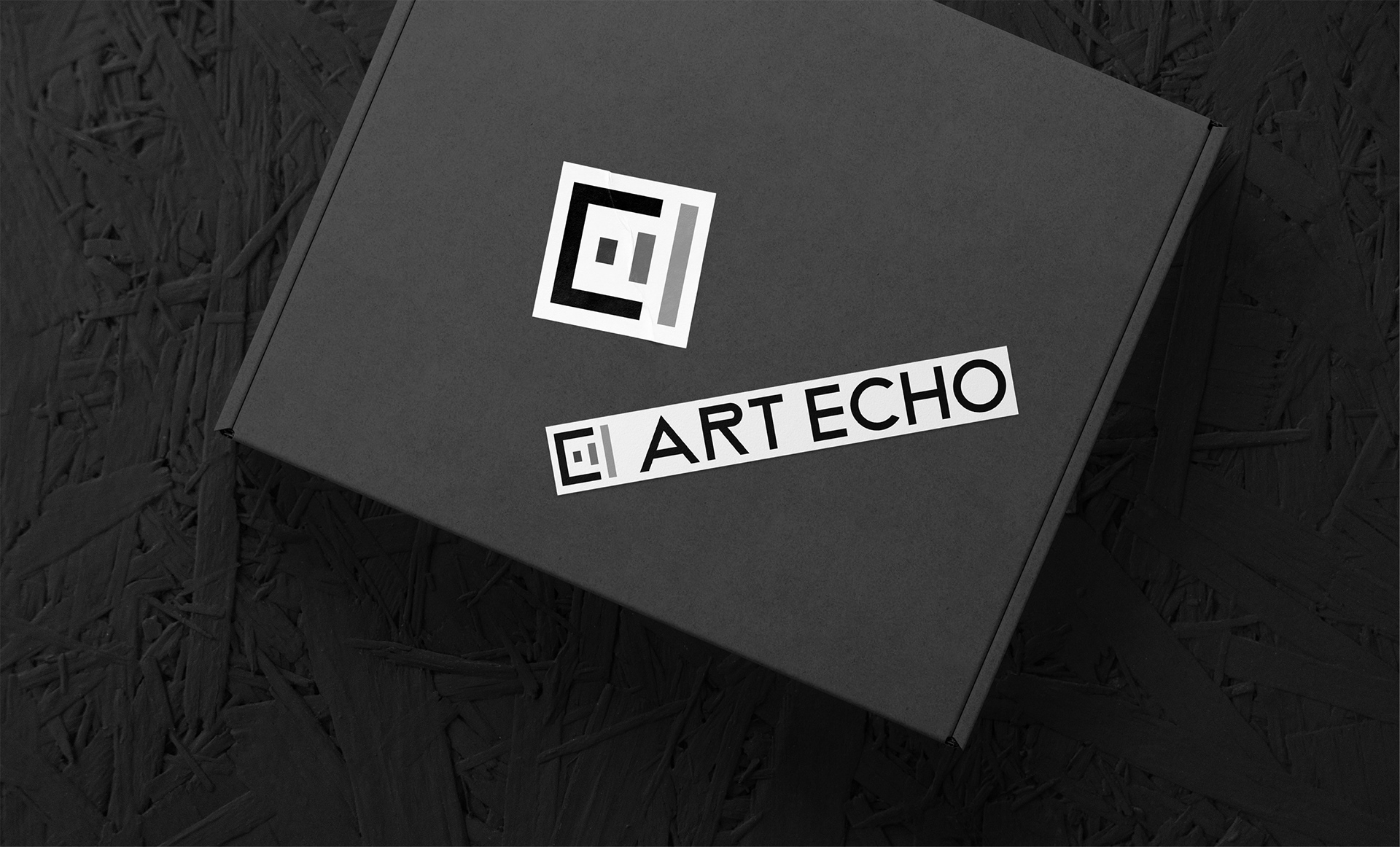
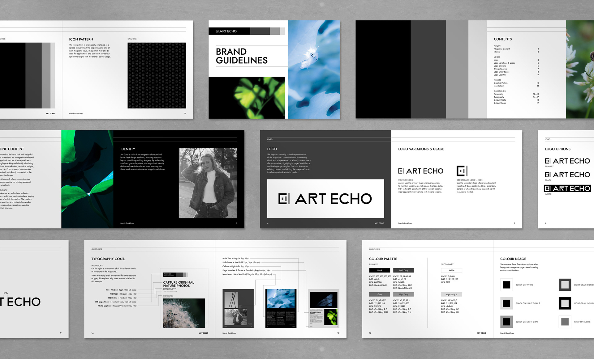
I began by designing the logo, which represents Art Echo’s mission of discovering visual arts. The wordmark is set in a bold, contemporary, all-caps typeface inspired by the sophistication of the Art Deco era. This choice reflects the confidence the brand has in its featured work.
The unique shape of the “R” adds a subtle point of distinction, reinforcing the magazine’s focus on design that challenges convention. The accompanying icon features an abstract, echoing canvas motif that symbolizes the magazine’s role in relaying and amplifying the arts. A refined grayscale palette is used throughout the brand identity to ensure that featured artworks remain the focal point.
Editorial
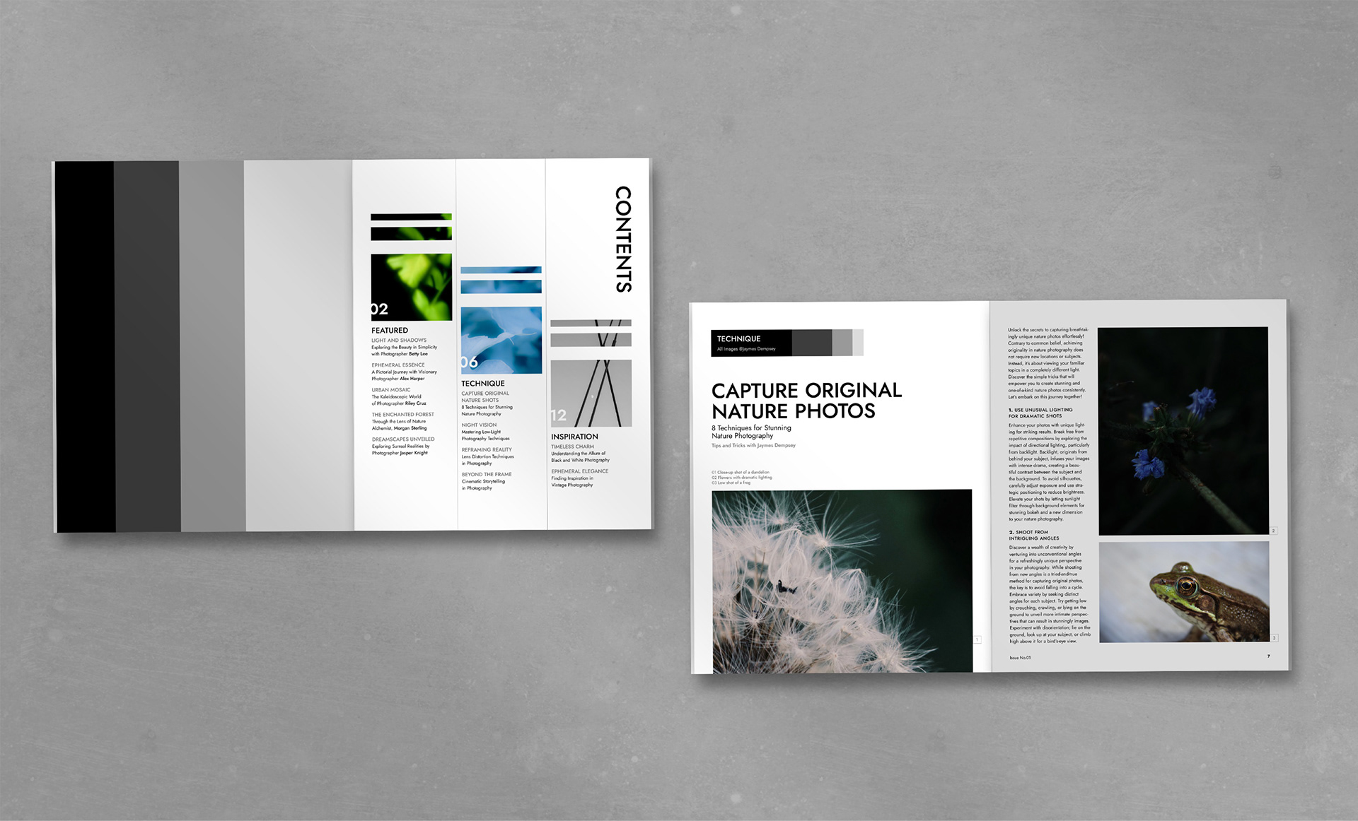
Aligned with the brand’s contemporary approach, I designed the editorial layouts using a clean grid system to create a clear hierarchy and consistent flow. Spacious compositions and strong alignment give the magazine a polished, editorial feel, while striking imagery remains the focal point throughout the issue.
Key Takeaways
This project strengthened my skills in designing a logo, creating a visual system, and producing magazine layouts that balance typography, imagery, and hierarchy. Working with a grid system highlighted the importance of structure and consistency, helping the magazine feel polished, easy to navigate, and fully aligned with the brand.