
BellyBox
Brand Identity / Packaging
Team
Solo project
Timeline
7 weeks
Tools
Adobe Illustrator, InDesign, and Photoshop
Project Overview
BellyBox is a hypothetical Canadian fermenting company and food-focused subscription box business that provides authentic organic recipes and handpicked ingredients. The brand is designed for fermented food enthusiasts and health-conscious individuals who are interested in supporting gut health through natural, at-home fermentation. My task was to create a full brand identity and design all items included in the subscription box.
Development
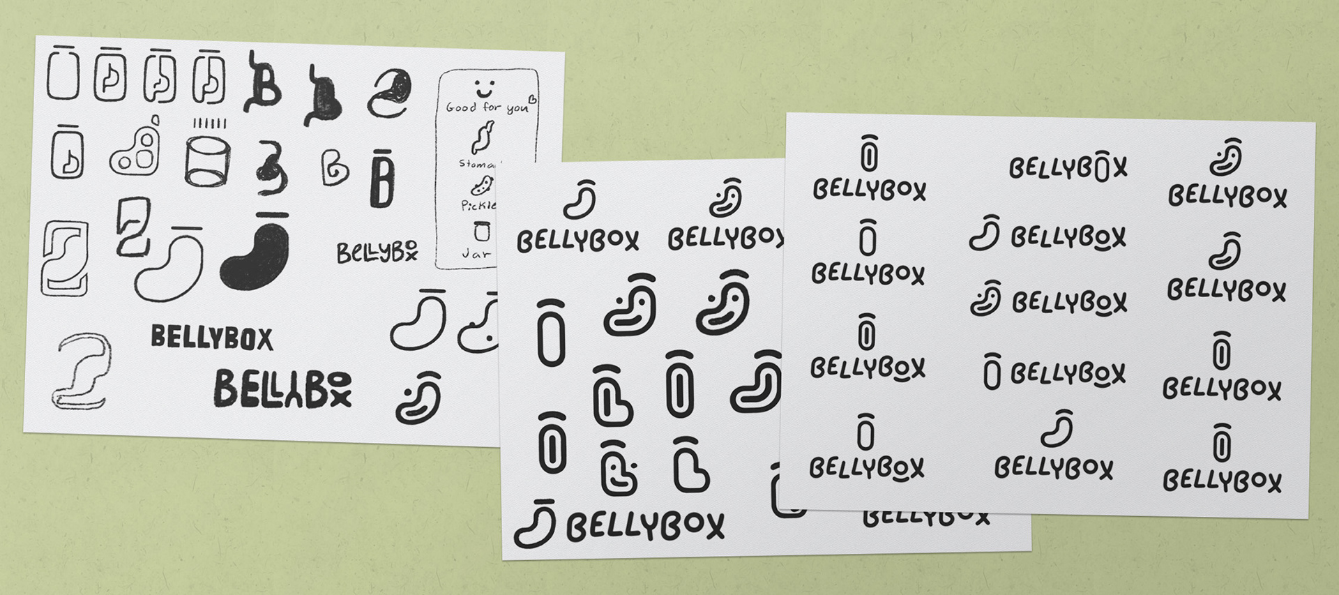
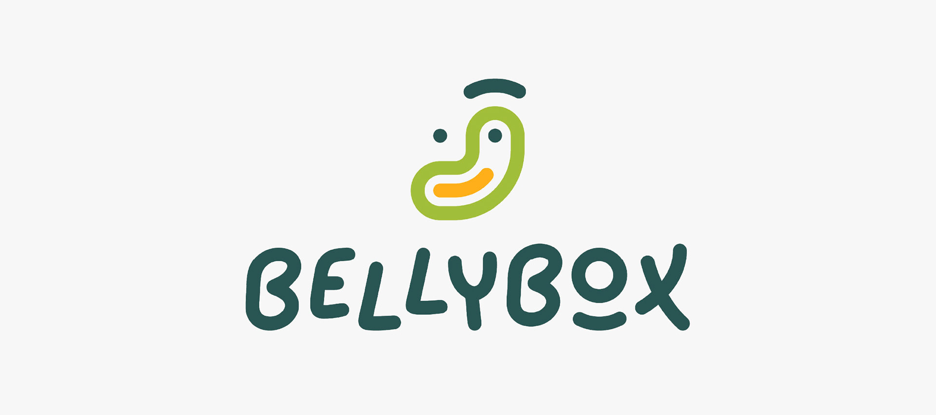
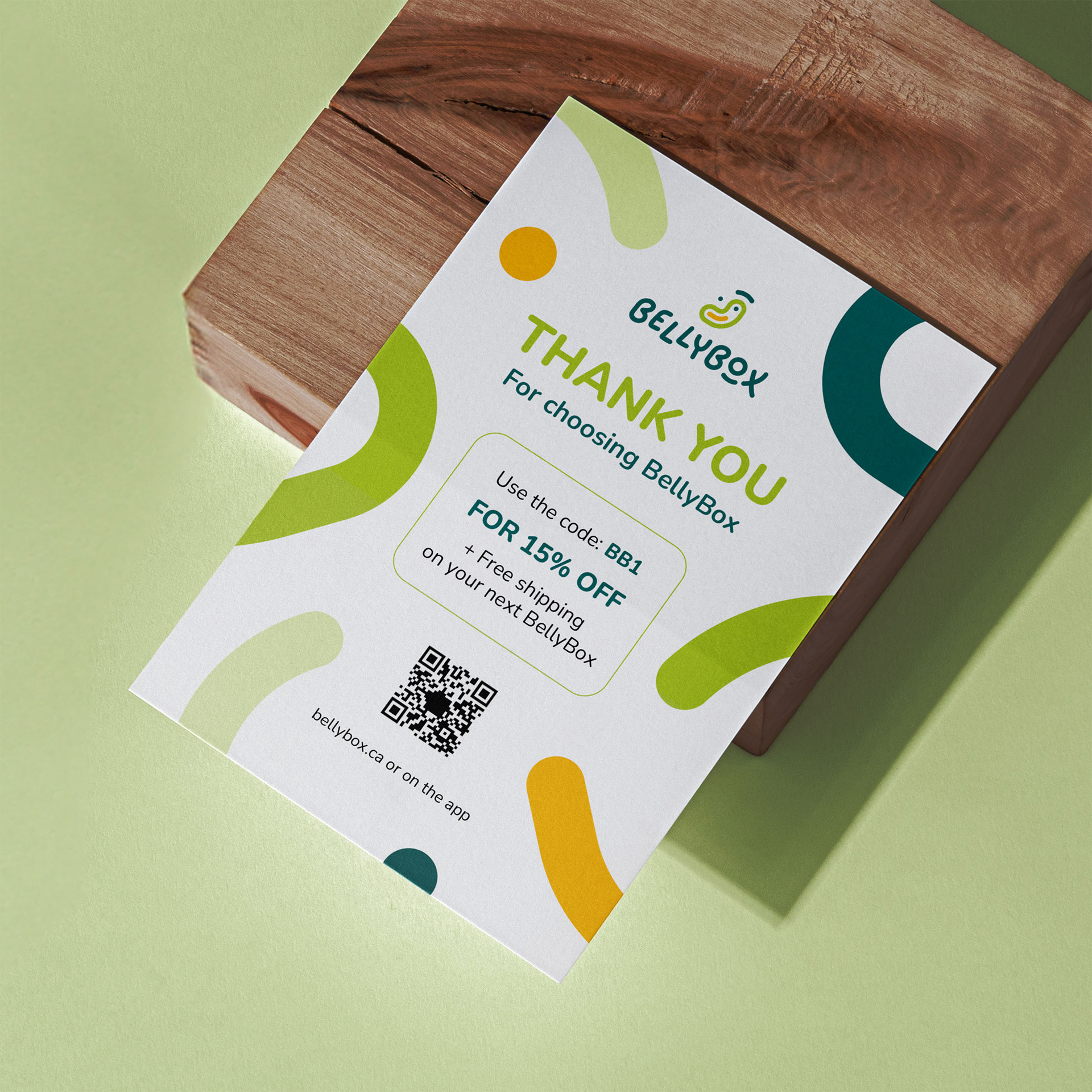
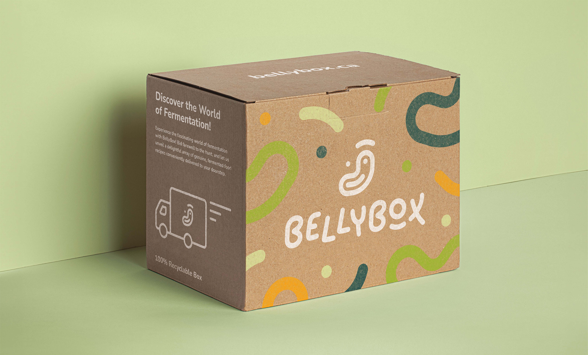
The main design challenge was to create a brand identity that clearly communicates the health benefits of fermented foods while feeling friendly, trustworthy, and approachable. I designed a logo icon that combines a stomach, a jar, and a smiley face to represent gut health, happiness, and fermentation. When used as a design element, the icon also subtly resembles beneficial bacteria.
The typeface was customized in Illustrator to support the brand’s friendly tone, with slight misalignment adding a playful and creative feel. A green and orange colour palette was chosen to reflect health, growth, vitality, and organic qualities, helping BellyBox connect with its target audience.

Brand Applications
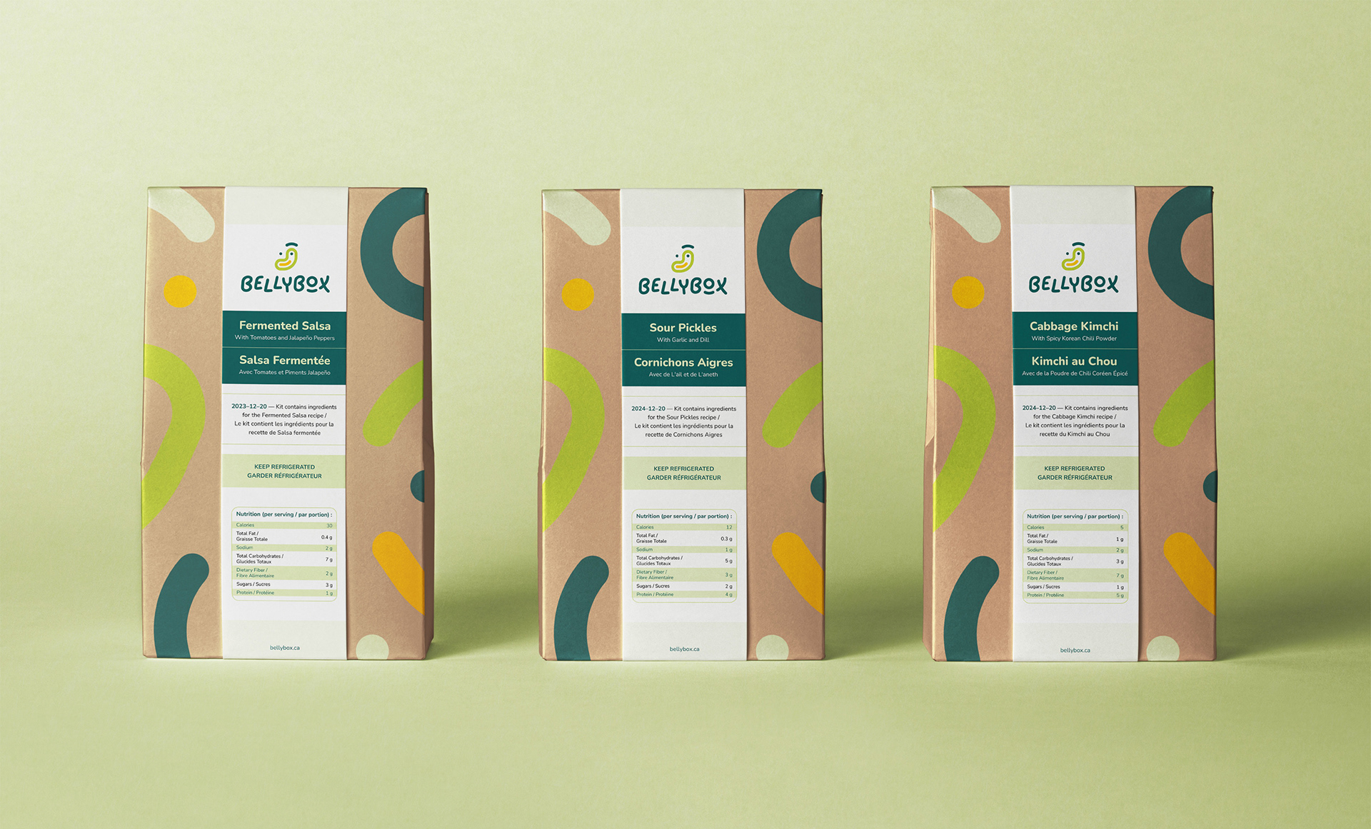
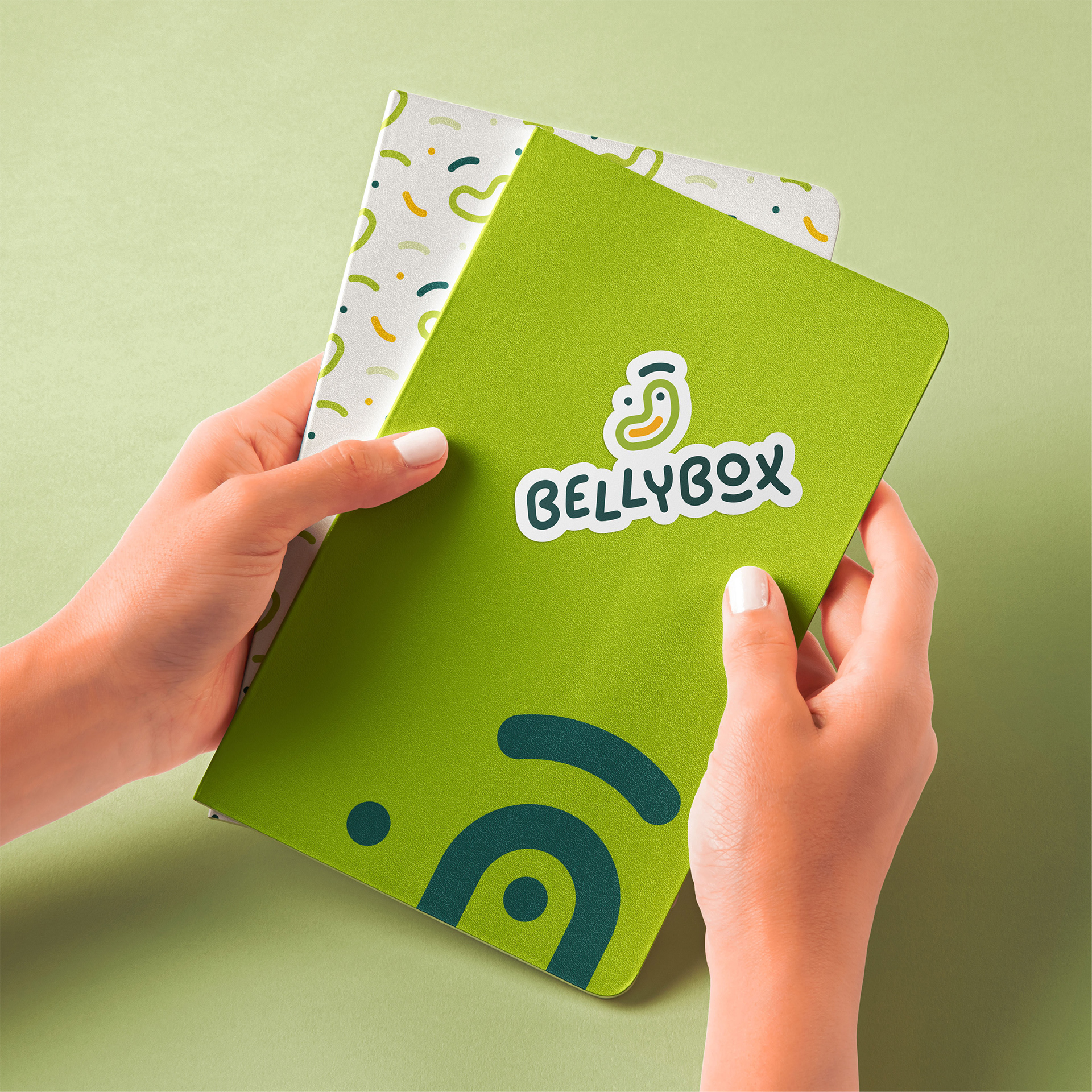
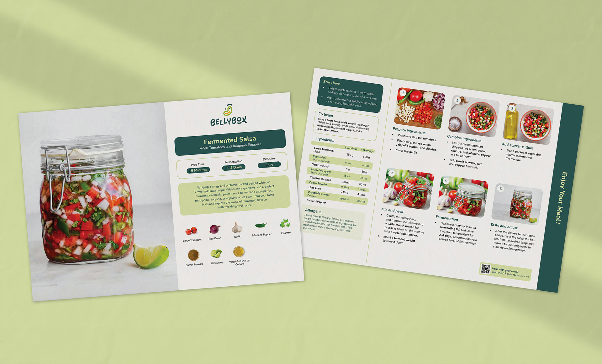
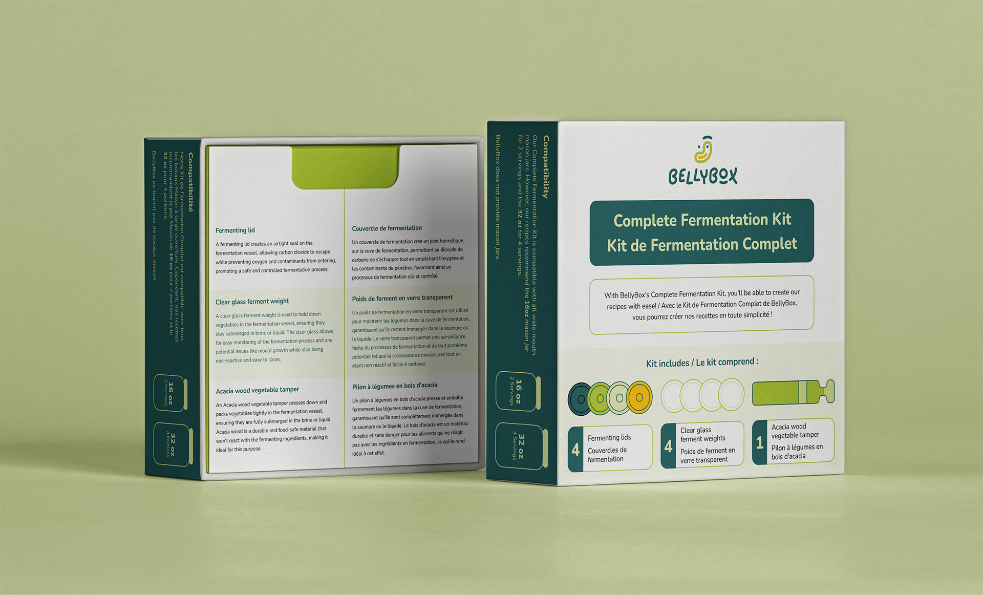
I applied the brand identity across all subscription box items, including the box packaging, recipe bags, thank you card, recipe guide, and fermenting kit. The icon and colour palette play a key role throughout the designs, while consistent layouts and hierarchy help maintain a cohesive look across all materials. Together, these applications position BellyBox as a clean, healthy, and trustworthy subscription box brand that aligns with the values of its audience.
Key Takeaways
This project strengthened my ability to build a cohesive brand identity and apply it across multiple products. I learned how thoughtful logo design, colour choices, and consistent layouts can communicate brand values and connect with a specific audience. The project also reinforced the importance of maintaining visual consistency across packaging and supporting materials.